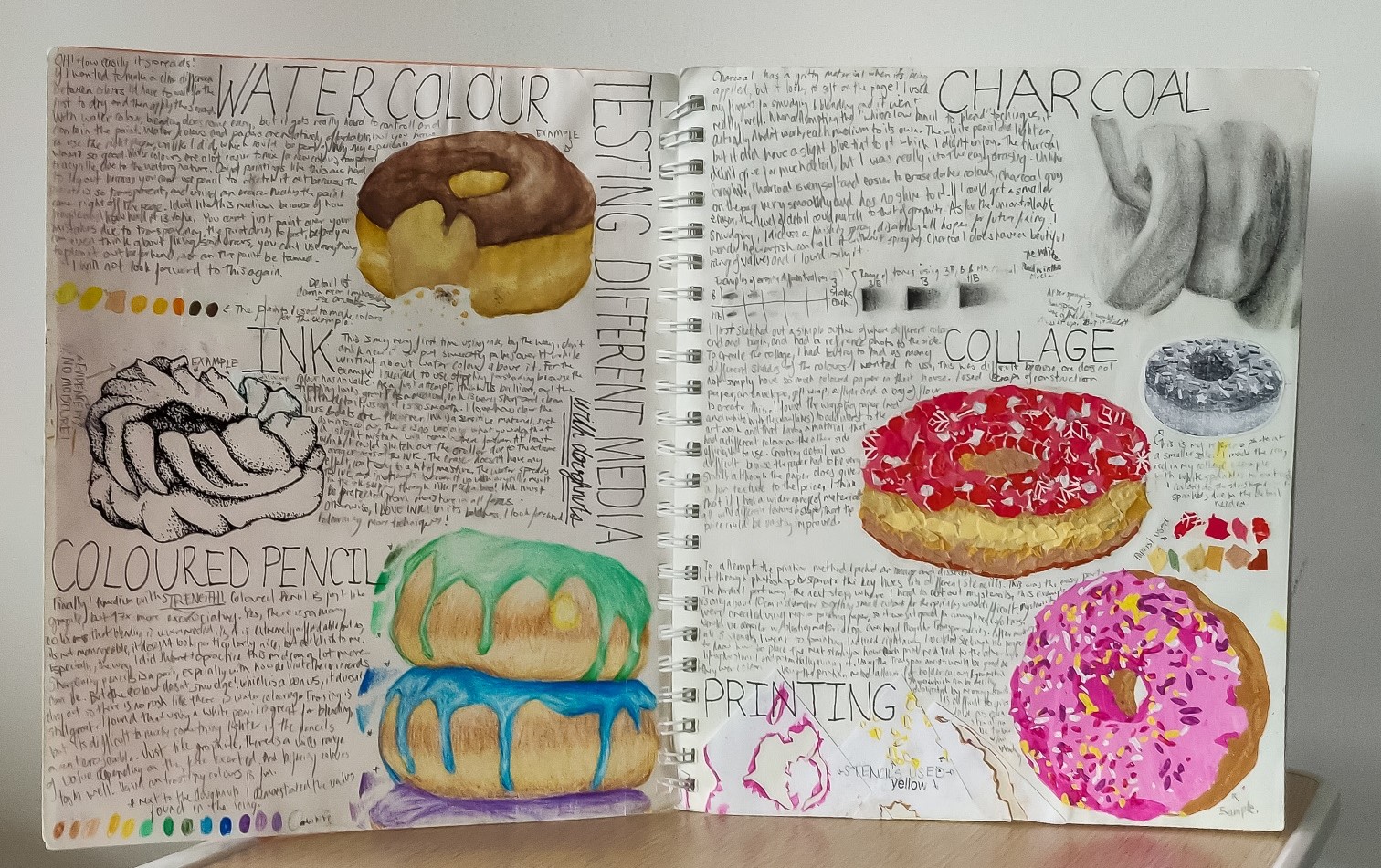
Creation is the game and technique is key. Here is a collection of various mediums I have worked in, showcasing the breadth of my skills and commitment to exploration, traits I found important to communicate in my university application portfolios. Starting with some sketchbook pages where I painted with coffee, honed graphite shading skills, compared mediums with a doughnut exploration and detailing their execution and challenges.

Entering my University era, with a major in printing, I get to show the flexographically printed wine label I produced in my final year. While it does use three ink plates, the majority of the visuals are delivered with tints of just the navy ink whereas the other inks, gloss and matte, was utilised to add visual texture and contrast on the header texts, stars and mountains. This two piece design included the right spacing and repeat length to increase efficiency and alignment for automated application to the bottles.

Print paper? NO! PRINT EVERYTHING! TRY ALL THE MEDIUMS! 2D? MORE D! 3D!


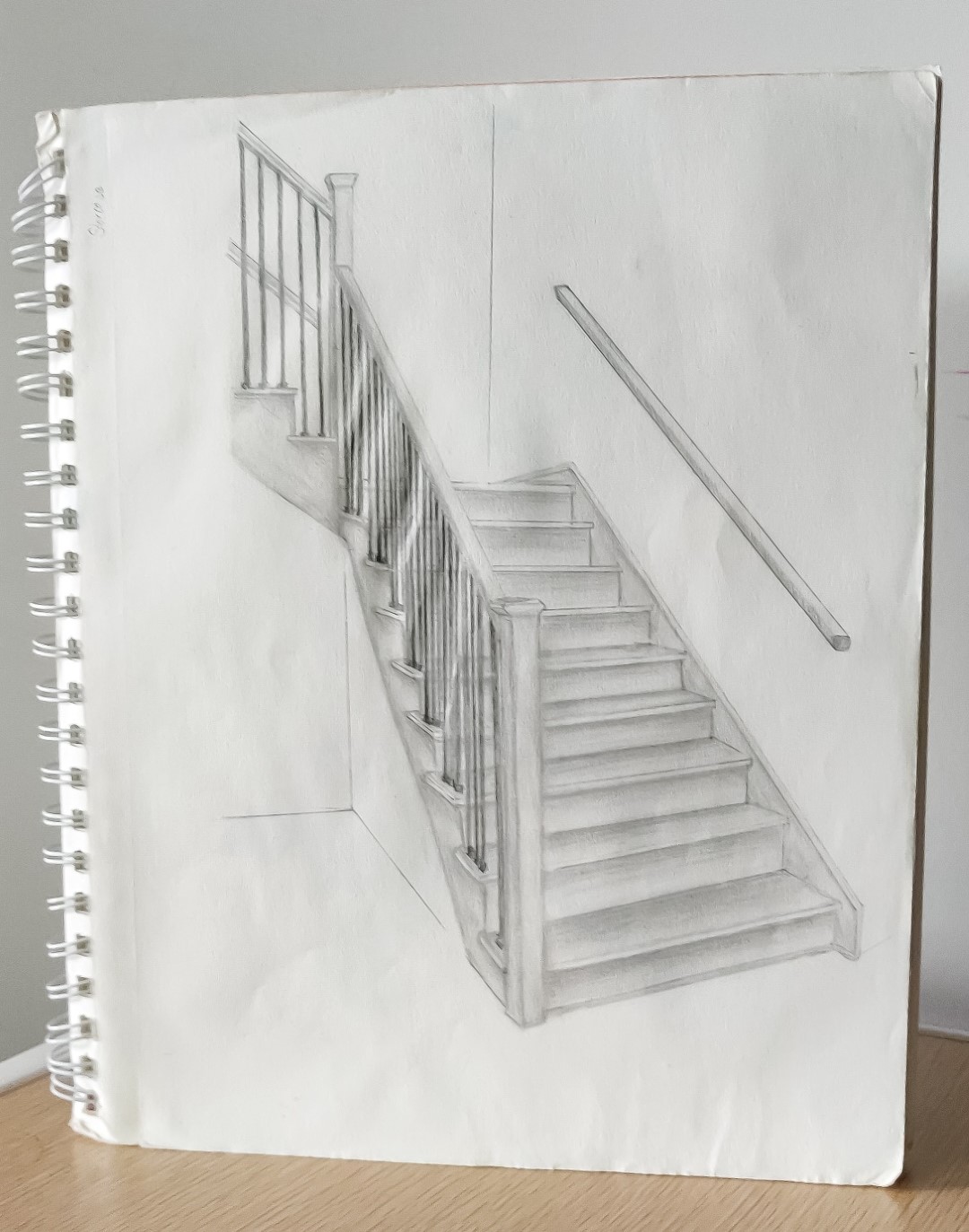
Graphite study of leaves from my backyard Study of doughnuts in watercolour, ink, coloured pencil, charcoal, collage and stencil printing. I filled up the space between the studies with details on my experience with the medium Graphite study of a staircase
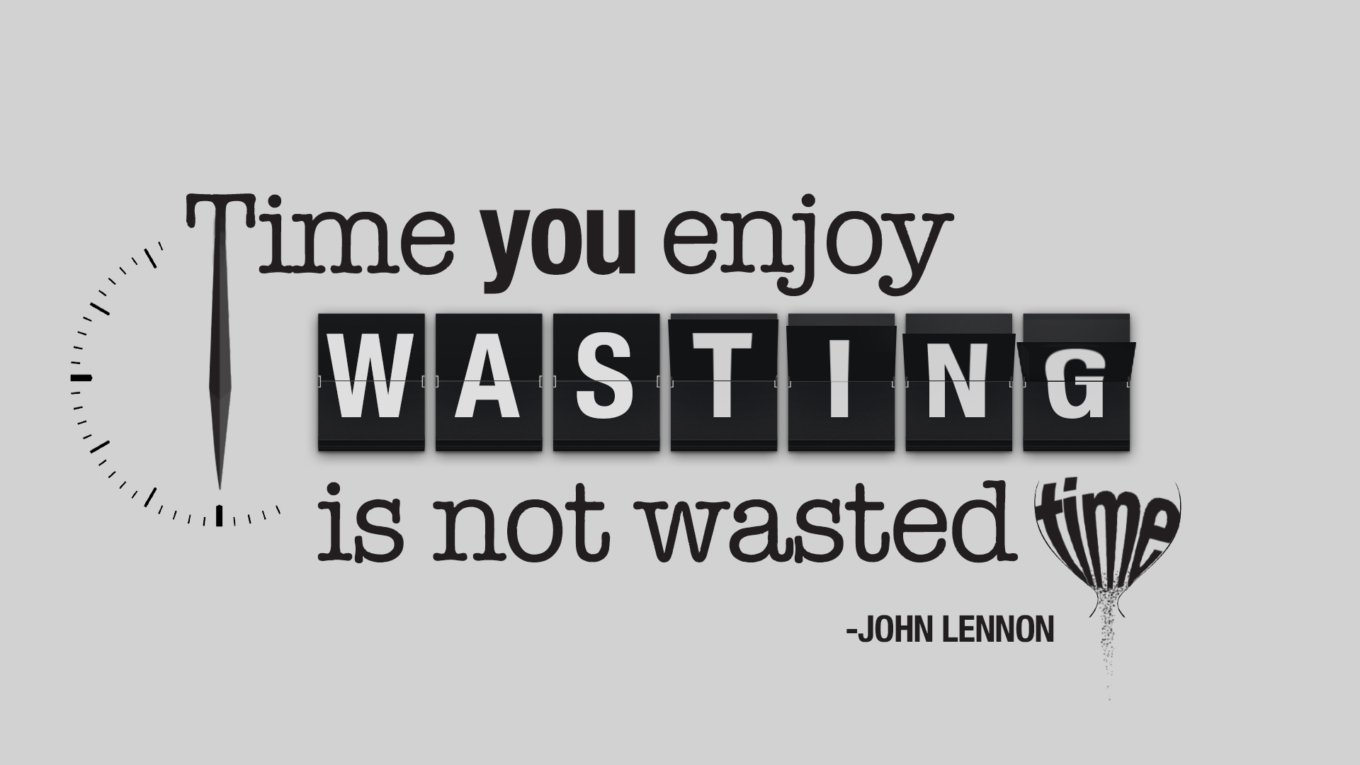
Hand drawn typographic study that begs you to think about Usher's song Photocopy of a sketchbook page breaking down how I would create an updated logo for my high school robotics team Photocopy from my sketchbook, a page about the creative process in making the typographic quote in the next slide Made with Photoshop, a heavily stylized adaption of a John Lennon quote I resonated with.
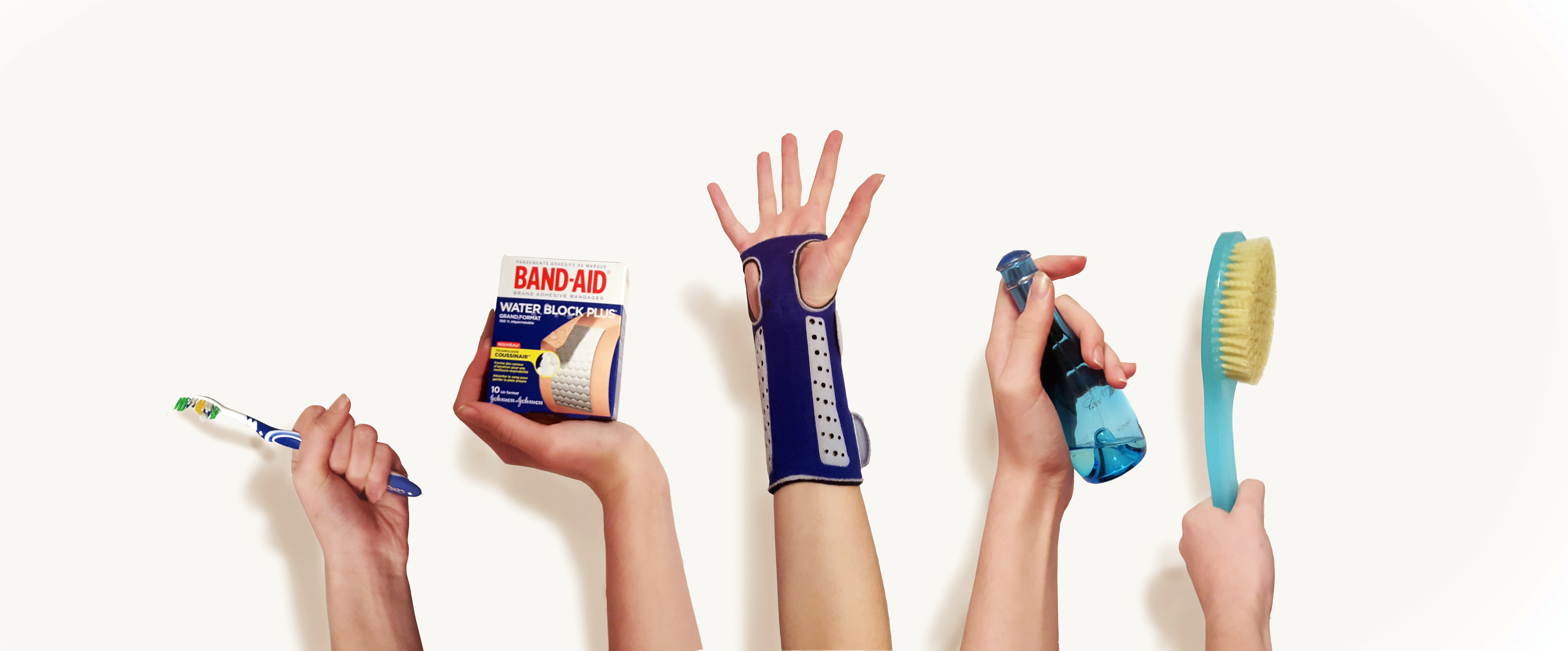
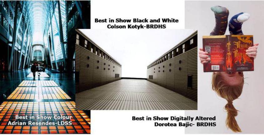
I compiled this in Photoshop for my photography class project with the prompt 'Something Blue'. The shadows are fake In my media class which introduced me to Photoshop, I created a piece which looks like I am slowly coming out of a book. This won first place in a county-wide competition within the Digitally Altered category

Try Hard Highschool Era

2016-17

High school is never easy for anyone, just like you would assume you wouldn't get culture shock returning to your birthplace & early childhood home. With no bus stop in that town or the next, I found joy in all the artsy classes my highschool had to offer. I grew a pursuit to excell and exceed, particularly with University applications around the corner.

Photoshop - Drawing - Concept

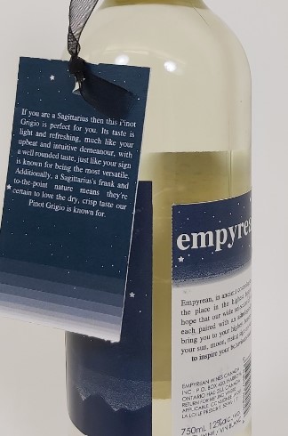
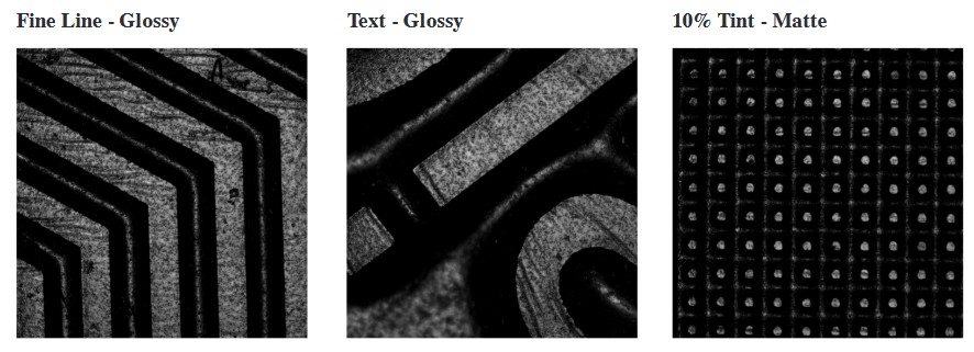
Render of our label design on a red wine bottle with a matching navy foil cap. Two of the plates, navy (Pantone shade 296C) and gloss, along with a press copy. The glossy unfortunately did not print as clearly as desired Our label was designed with the application in mind, setting the space in printing the two labels for the right bottle dimension so that there is equidistance betwixt each label's start and end. The tag was digitally printed, affixed with a matching ribbon.
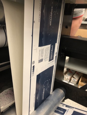
Checking out our plate under a microscope, taking some BetFlex pix, are we? The one photo I could find of this actually in production

Flexographic Printing

2019

As a group project in my third year, we designed a wine label to be printed on a Cadet model 700 with a 10.25" repeat length and three plates, navy, gloss and matte varnish. We mixed the Pantone 296C ourselves. The astrological themed design used the matte coating to incite a soft luxury feel and add contrast with spot-gloss on the header text and stars.
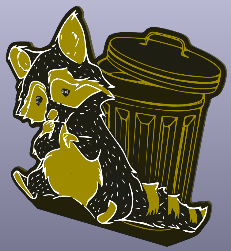
Ah you probably thought this paragraph was going to be about 3D printing, maybe not if your screen already revealed the raccoon card. This now is about circuit board printing! My brother, Savo Bajic, has a long-time interest in circuit boards, creating projects like a transit timer & christmas ornaments. You can check out his website here. I love the aesthetics of the boards. Did you know that the 90 and 45 degree marks you typically see on boards is due to early design software limitations? An “efficient” line is essentially unnecessary for circuits! Lets get back on topic.

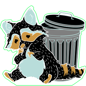
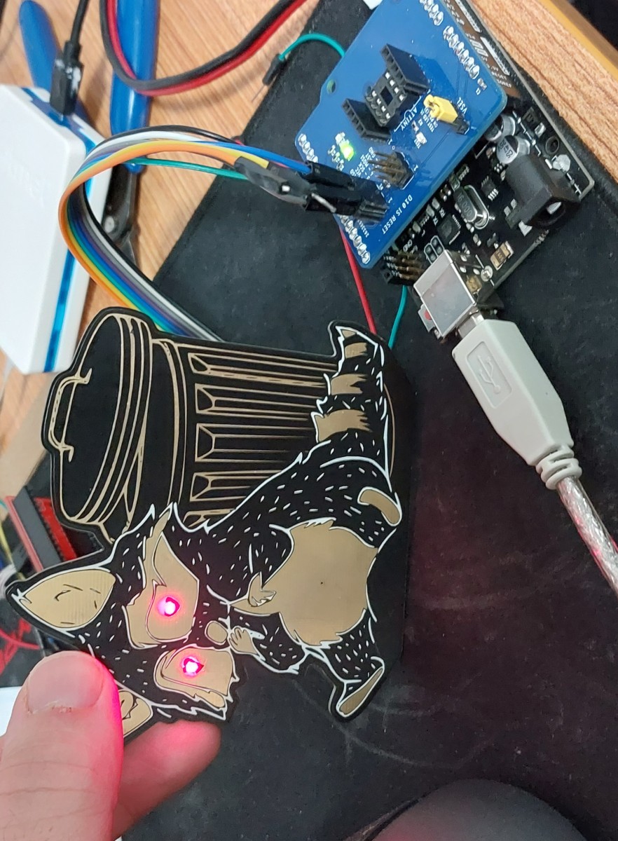
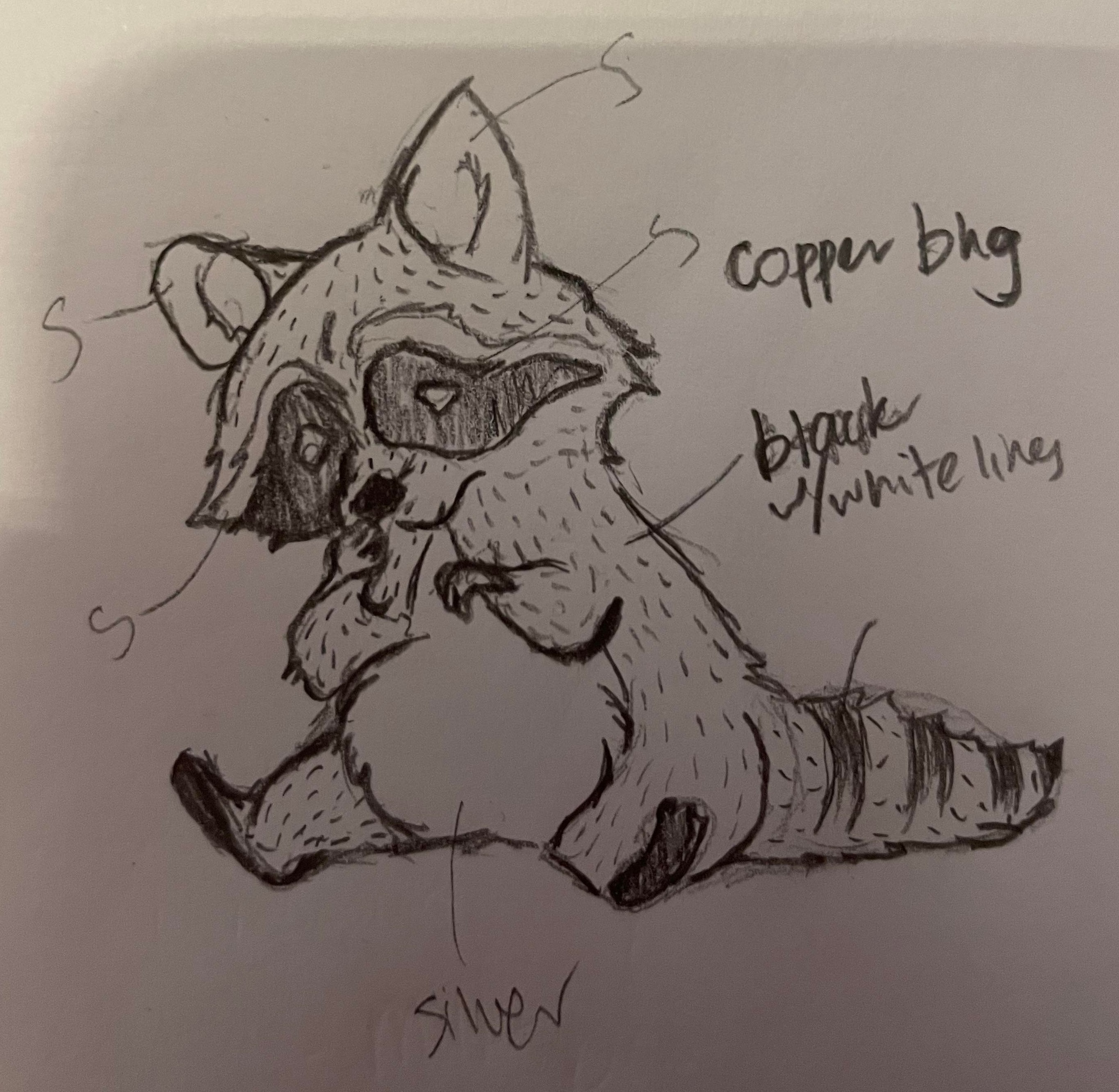
Before the two of us went on a holiday, we wanted to make some gifts for the friends hosting us in Paris. One of them finds raccoons absolutely adorable despite our tales of them being Toronto’s vermin. These trash pandas would make the perfect “from Toronto” gift, our concept was to create a board which when touched on the belly the current would be interrupted, triggering the raccoons eyes to light up. I was tasked with the visual design, learning about circuit composition and how to turn these technical elements into aesthetic ones. The contact area would require to be soldered silver, over a gold mask which was kept exposed in other areas, additional details were added with white.

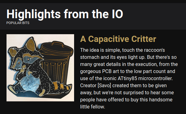
Savo spent quite some time troubleshooting the power draw as the boards were killing batteries far too fast when in standby. Eventually he configured it so that the battery was estimated to last over a year. Its been over 15 months since the first Raccoon gang was distributed and no one has needed a replacement battery since. On February 15th 2023 the project was featured in the Hackaday newsletter after submitting it to their 2023 Low Power Challenge. My name wasn't cited as a co-creator, but we all know it wouldn't be nearly as cute without my touch.

It was so fun to create a gift that when I had to return early from our trip and missed my brother and company there, I was determined to create a gift from my realm of specialty - pakidging :3

Unfortunately the graphic file I has was too complicated for the rapidly declining plotter table I started with in my "Secret Evil Lab of MASS DESTRUCTION in Plastic Solutions", as I liked to call it. So I had to ship the second copy I let cut to completion in order to ensure its arrival before his departure. I’ll admit the failed outputs still look cool, like 3D printer spaghetti. I made the card to be a very shallow box to fill with near flat knickknacks, and doodled all over to update him.


The sketch of the raccoon and colour designations to make vectors using available board colours, copper, black and white print, and silver solder. Render of the circuit board before ordering their manufacture The vector drawing I supplied. The blue (silver) ears weren't added as the solder destroyed the visibility of the inner details. The grey was a slightly off tone from the black, but the difference is only visible up close to the board.
The design was featured in the Hackaday newsletter from Savo's submission for their low-power challenge A shot of Savo testing their operation before the facelift

Laser-Eyed Raccoons

2022

My brother and I collaborated on this, his specialty is circuit boards. I made the artwork of the Toronto icon and their victim. When you touch its belly the eyes light up red. Savo focused on getting them to be ultra low-power, enough to last years. You can read more about the electrical side, or Savo's other sick projects, here.

Getting the right cut height which wouldn't destroying any integrity
       of the postcard design was a layered task The front of the card featuring the Toronto skyline with an arrow pointing in the direction I was working, 40 minutes out of the city. I did doodle myself at the apartment rooftop pool which IS in the city, as well as a Loch Ness monster which IS in the water
I made a wrap to protect the postcard in shipment, and doodled all over thus including a Czech cartoon in a Van Gogh twist The back side of the postcard protection wrap with doodles even I have difficulty recalling any order of my ideas then, I believe I let it flow like a dream

Plotter Postcard

2022

While my brother was gallivanting in Paris and I was working in Ajax, I saw an opportunity to attempt using the Zund Plotter table with the two tools I had for it, cut and crease. Using scrap board, I attempted to create tints with close together cut lines, or closer so that I could peel the clay coating away, which shows in the bits I left on for a rustic vibe. I took my trusty red felt-tip and after a long day at work I doodled away a kaleidoscope of thoughts from home to send to my dear brother.


Ambitious as I am, already with an added concentration of Packaging to my major, I believed I could also attain two additional minors (not including my exchange minor) if I took some summer courses. One of which was a 3-week intensive course and my introduction to 3D printing. This format really allowed me to focus solely on the course which led to a strong understanding of 3D printing technologies and strategies of creation

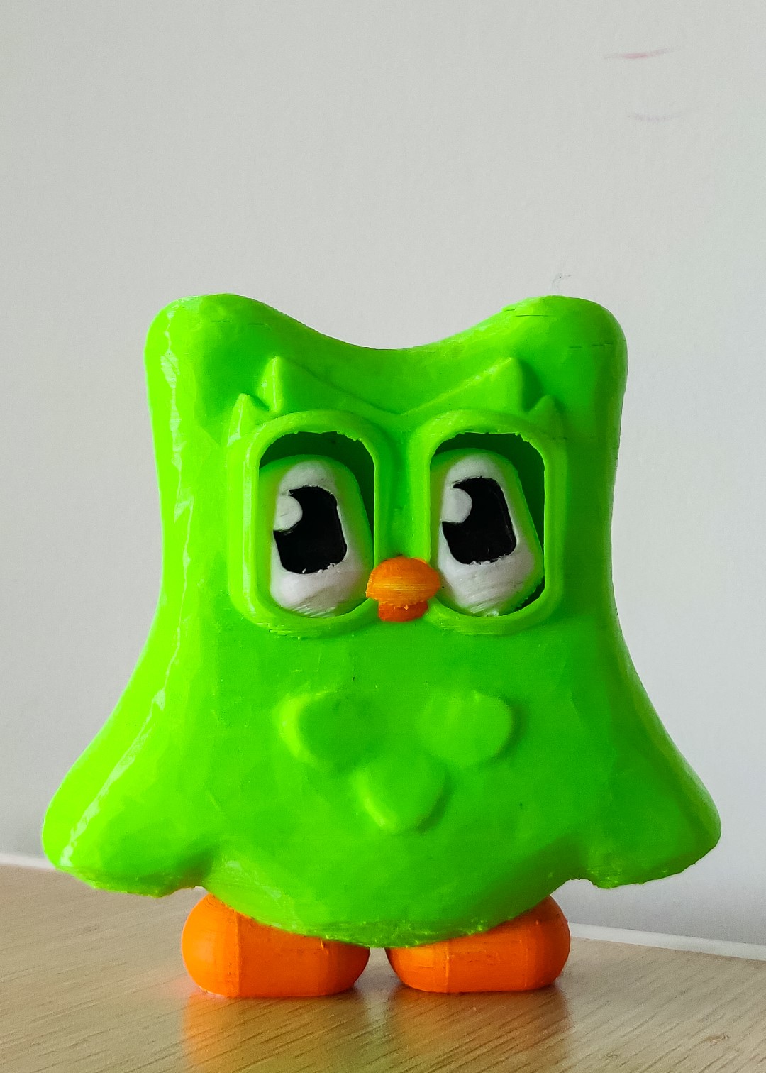
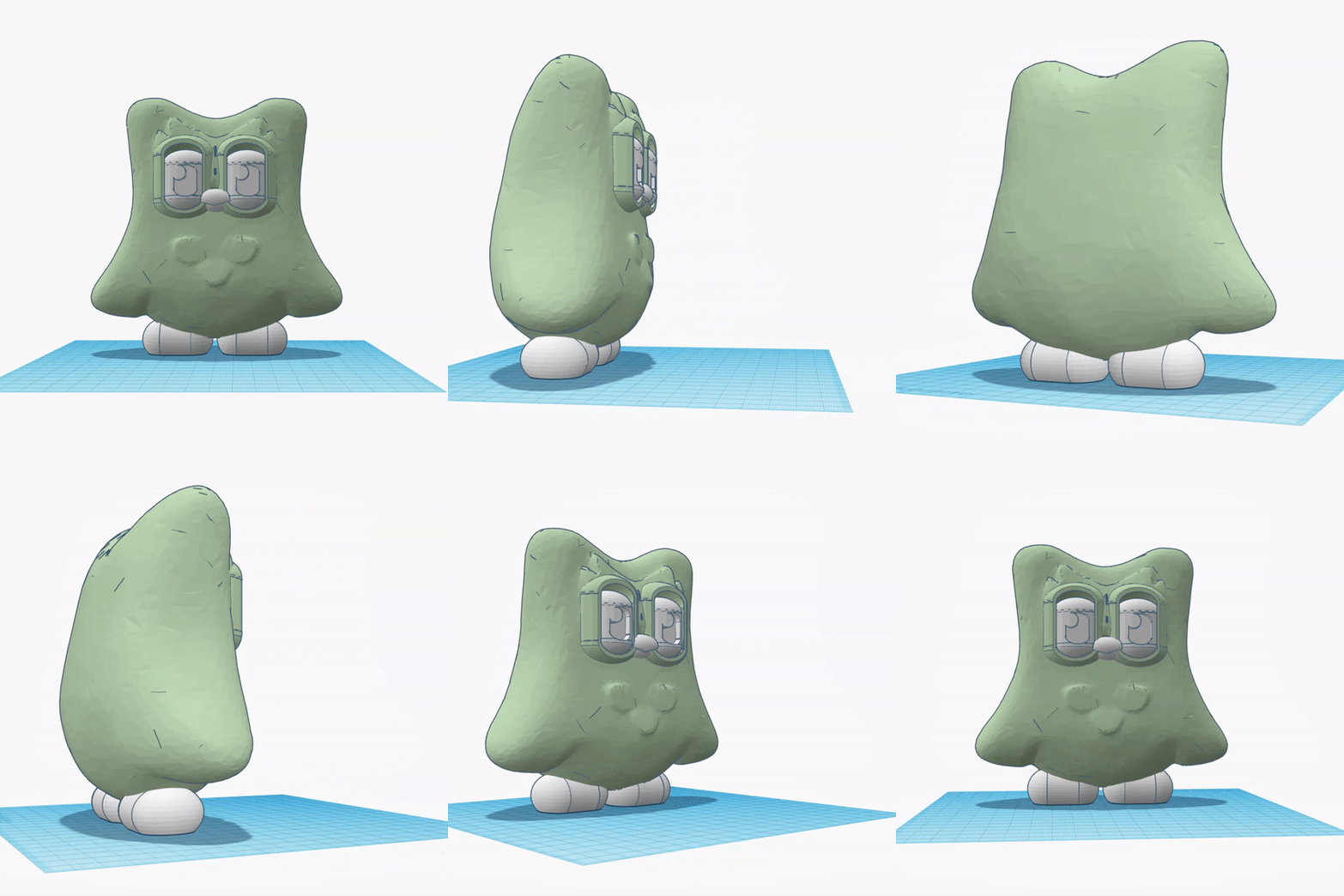
My final project was a 2-colour print of Duolingo Owl, inspired by the then trending “Evil Duo". My partner and I designed this shakeable owl in TinkerCAD and Meshmixer - two free-to-use softwares. Output as a single piece using a dual extrusion printer with green and white PLA, hand painting the beak, feet and the two sided (red and black) eyes you can change between by shaking or spinning the eyes in their sockets. Retained as an example for future classes, I was informed it would also be missed from the background of Donna’s class cam when I picked it back up.

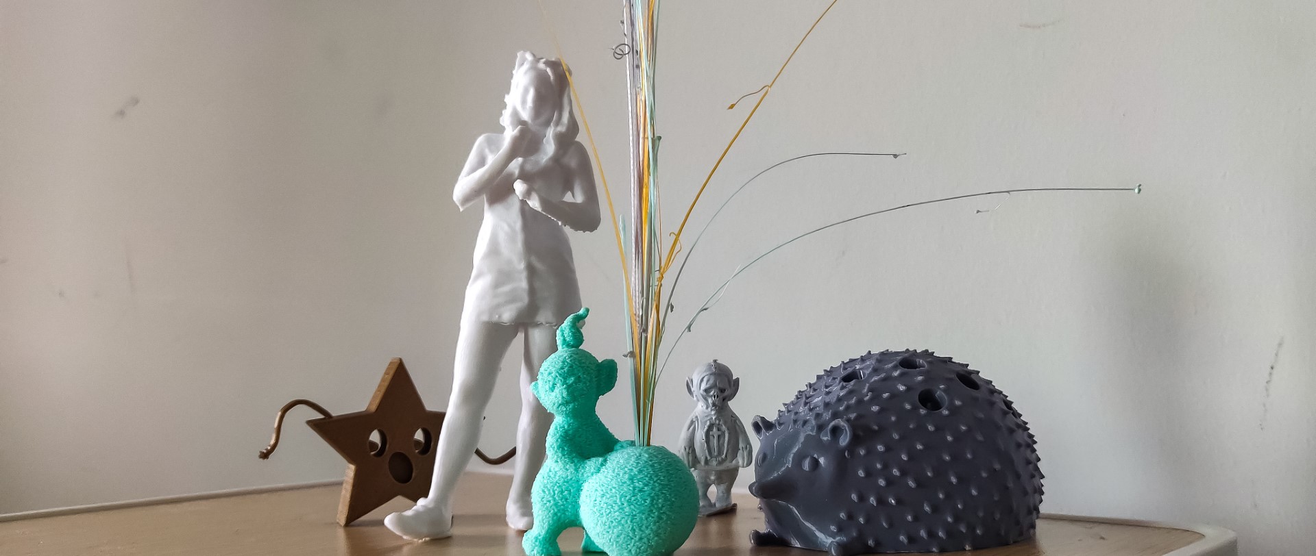
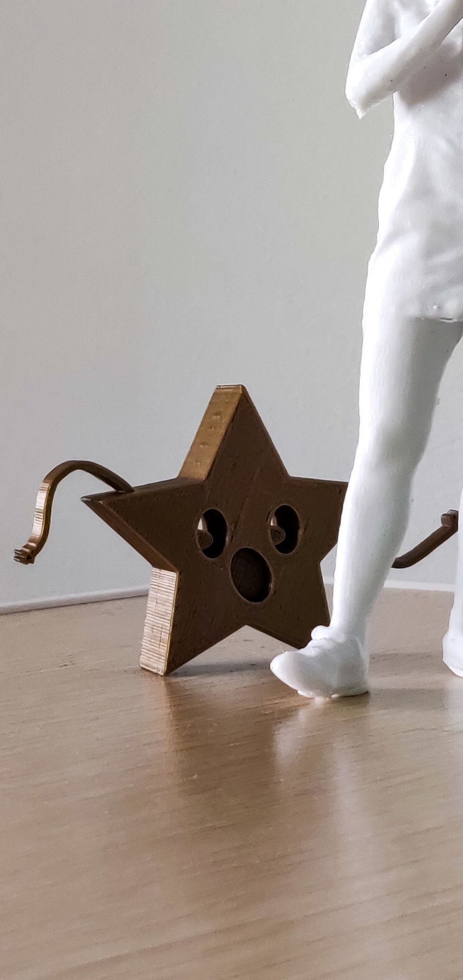
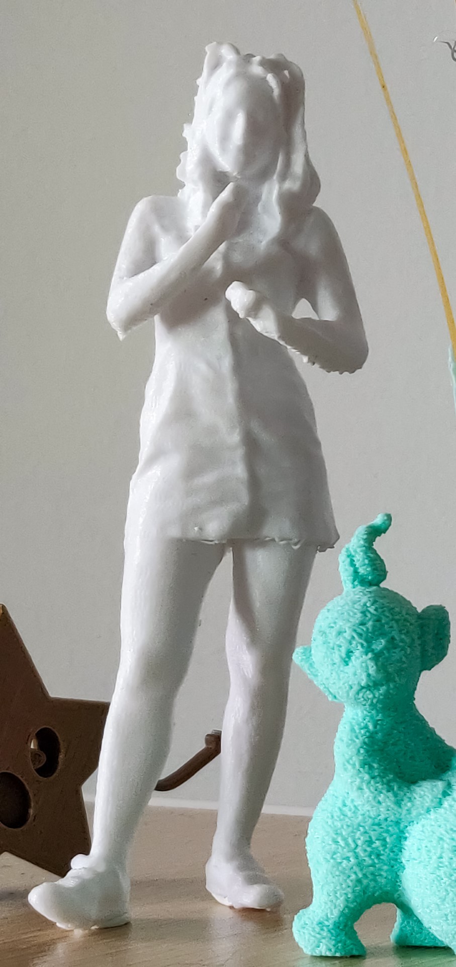
The dancing star is the first 3D model I have ever created. I used varying depths of the 2D shapes to convey the sketch in 3D while maintaining the character of the illustration. To the right of that in the group shot is a printed scan of myself doing the ‘whoa’. Since it used single colour printing it was important to create details using form, like choosing a denim button dress which would have well-defined curves prime for handheld scanning & printing.

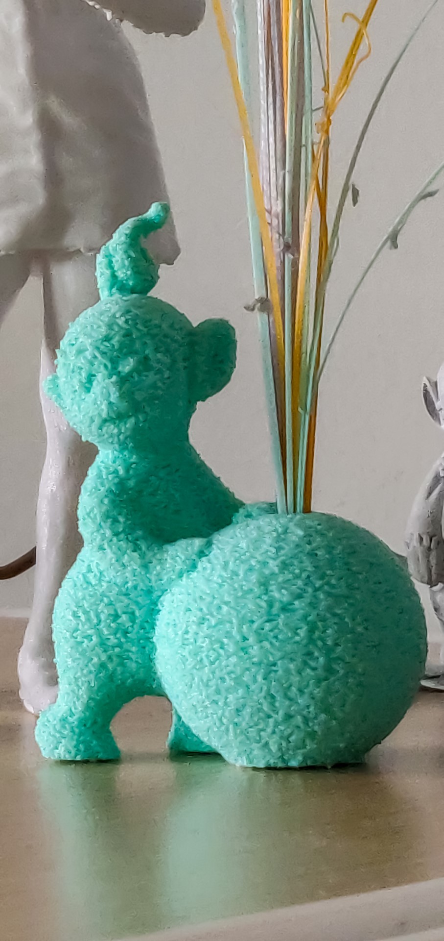
In more recently projects, I have been focused on technical creativity, which led me to create the teal fuzzy teletubby which was altered to hold my collection of priming lines created by the Ender 3 printer I was using at the time. It makes for cute desk decoration where I tracked my growth as I continued printing. The reaper teletubby was not designed by me, but through it I got to learn about SLS printing.

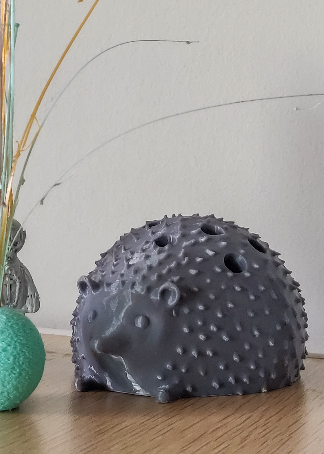
I still have work to do for my hedgehog project. I sculpted the hedgehog using Meshmixer while watching the entire Sex In The City film series (I'm a Samantha). I taught myself Fusion to engineer the inner workings and additional pieces. I’ll update this page soon to showcase how I intend to have the quills (or pencils) pop out of the body.


Our Duolingo print is sitting pretty with calm black eyes, good job on keeping your streak up! Duo is proud. 360 views of our model in a digital form, here you can see it without the painted-on colours.
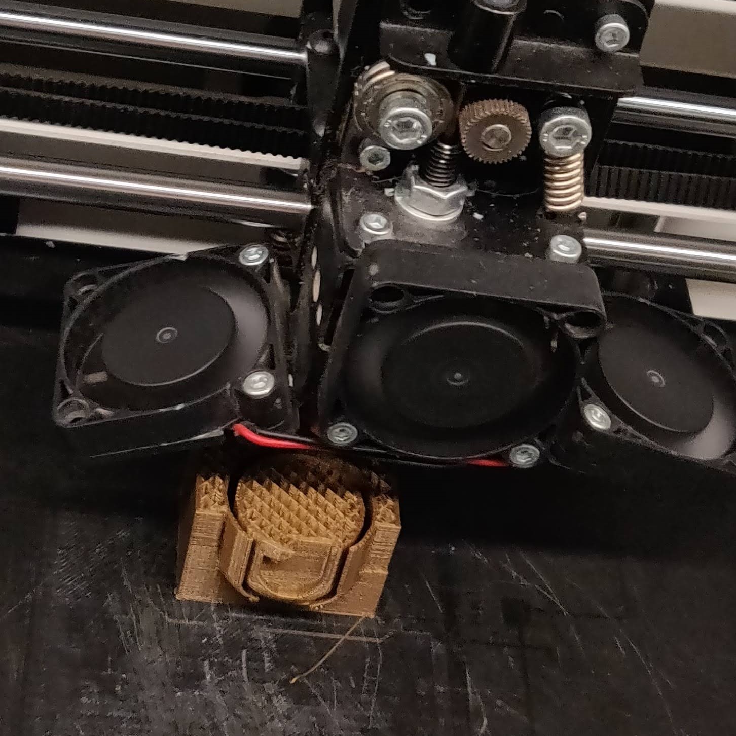
Perfecting the eye design involved tests in finding what spacing & minimal support was needed for a successful print where the eye could move freely in good form

Duolingo Owl Toy

2019

Created with a partner as our final project in the class where the task was to print anything using advanced 3D printer techniques. With Duolingo taking over most of the memes of the day, we were inspired. Sculplted in Meshmixer & designed in Tinker, a two colour (Green & White) PLA print-in-place with shakeable eyes which go from red to black. Additional colours painted within finishing process.

Collection of 3D Prints which I don't have enough to talk about on their own, but make a nice collection
My first 3D model I both designed and printed, just a combination of shapes to make the face, and I hand drew out the arms. I think of Adventure Time when I see it In the 3D printing course, we had access to a full body scanner of which my friend and I took total advantage of scanning all sorts of funny poses, this one being me doing the 'Whoa'. Not pictured is a print I made for my mom and grandma where I pushed the single-body scan to capture my brother and me in a side hug, adjusting the scanners mishaps manually with MeshMixer I converted this Teletubby model I found online to function as a vase for the little sticks of PLA the Ender 3 would create at the start of each job to clear out the nozzle and get it flowing well. I also played with the slicer tools to create the fuzzy effect This hedgehog was fully sculpted from a sphere in MeshMixer before I took it into Fusion to attempt making it look like an old wooden toy where if you lift the handle the quills would come out the holes you see here.

Miscellaneous Makes

2019-20

Assorted projects from my 3D printing course and other explorations from when I had borrowed an Ender 3 printer.


My Communication and Design minor provided many opportunities to practice the more visual side of creation within my undergrad. There were also courses digging deeper into the theory. My favourite class of this sort was Introduction to Semiotics, where we studied how humans extract meaning from visual means, throughout history and today.

For my second minor – Advertising – one of the projects was to fabricate an app prototype. My group and I pitched Ikea Ata, Ata being a Swedish phrase for “to eat”. The concept was to advertise Ikea products through a video call/live stream cooking experiences in the app where users can follow recipes and cook together during the pandemic, earning points for Ikea coupons. The prototype was designed using Adobe Illustrator and brought to life using Adobe XD. You can experience the app at this link here.

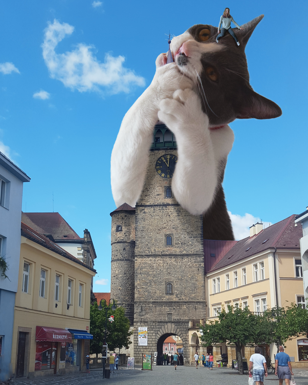
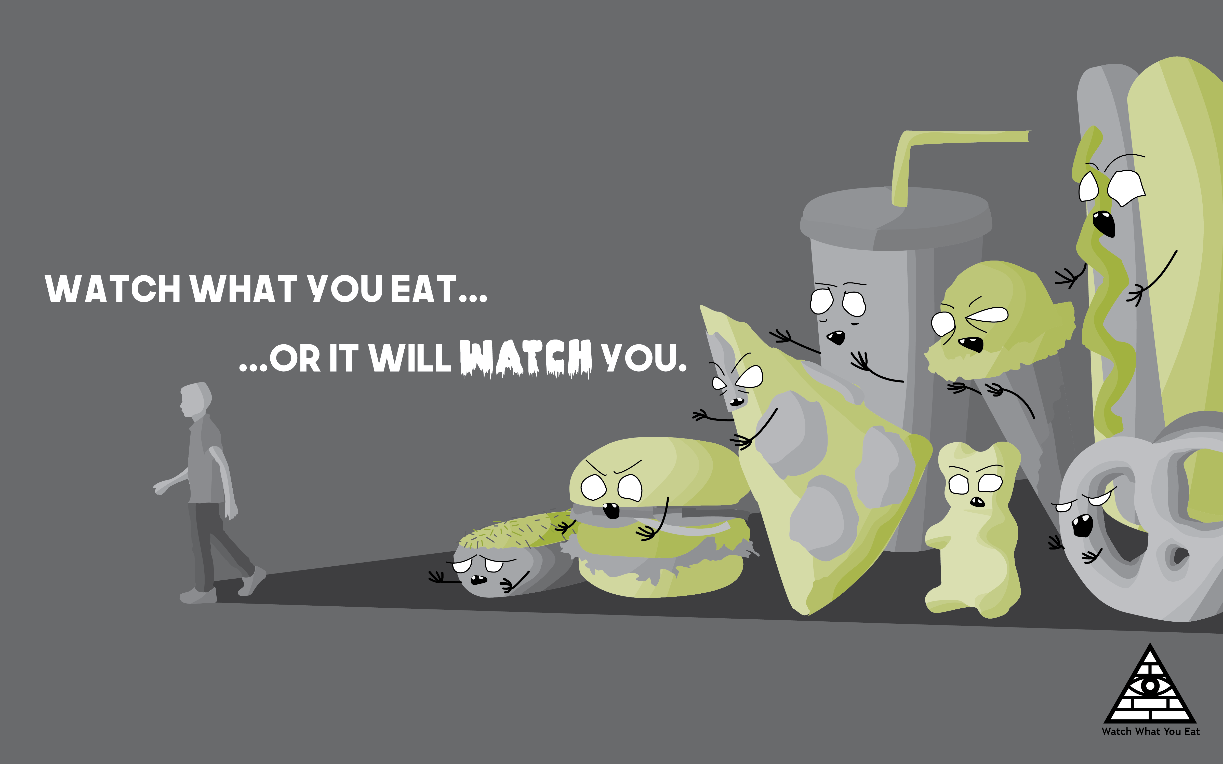
I also made some more posters in my undergrad – my favourite being the giant cat eating the clock tower, cropping around the fur was rough! The oldest one here is the "Watch What You Eat" two color offset lithography print from my first year. The mummers play poster includes artwork I drew from scratch. The ugly stick (a traditional Newfoundland musical instrument fashioned out of household noise making items, under the same cultural umbrella as the play) features a little something from each character . I also developed a website for the production company, more on that here.

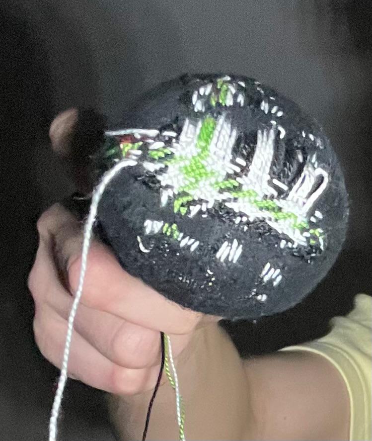
We love creating and trying new things - this past year I picked up a few new hobbies. Crochet, mending socks, and gardening but most sickly - carpet tufting! I scoured far & wide to find a reliable and not overpriced tufting gun. Exploring whether to buy a beginners kit but then deciding to make my own tufting frame suiting the width of canvas typically available. This was my first independent woodworking project (unless you include marble mazes composed of garage scraps in grade 3). My first carpet was a black and white vortex illusion and with all the set up and yarn material it cost >$400 until I started making more pieces. I was dedicated to discovering my own methodology, working from my memory of seeing others work and learning from mistakes along the way. Instead of proper backing fabric I used a garbage bag! Currently, I am in the middle of a few tufted portraits of my cat - exploring how to “paint” with different yarns in this new medium.

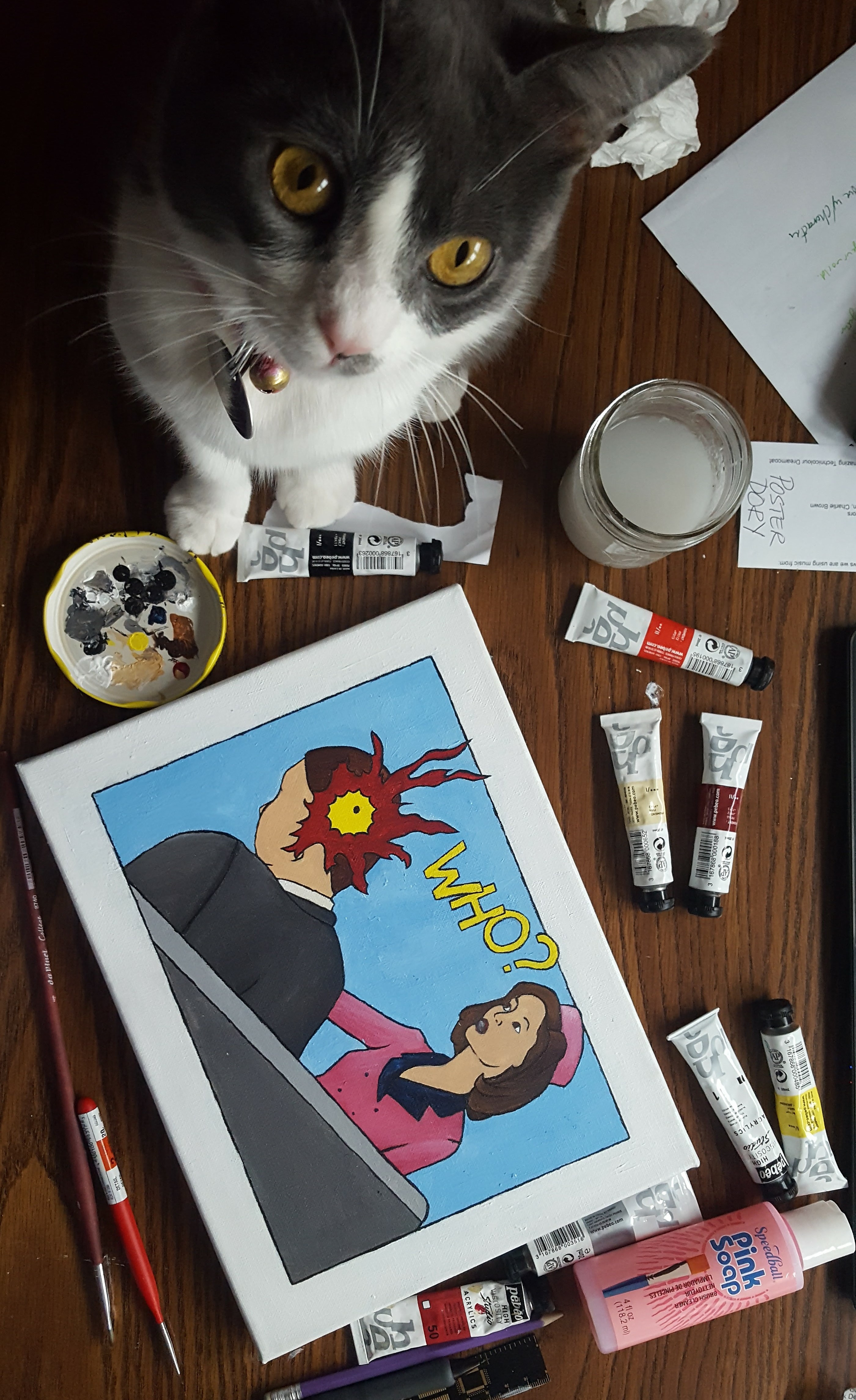
In high school, Cirino’s art classroom had a similar explosion of creative enablement like Papak’s photography class. In grade 12, our oly constriction was that we needed a theme across six projects, mine was the 1960s and I still cant get over some of what I made, like the fondant spiderman on a Vespa, shooting spaghetti, or a remix of Lichtenstein's 'Wham!' Re-quoted on the mysterious assassination of JFK. The true icon being Jackie, our sheet metal eating queen.

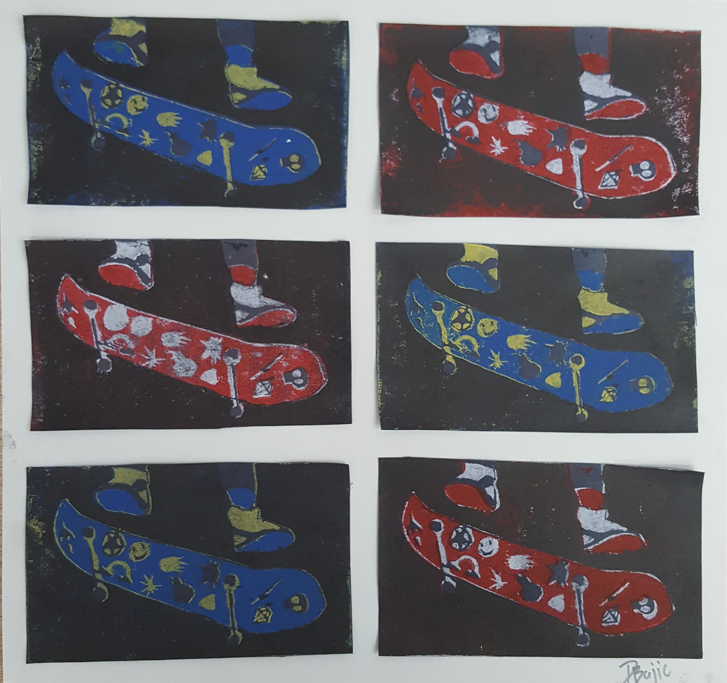
Printing was also a present fascination back then, I did many projects using stencils made of projector copies and carved linoblocks to make prints of skateboards.


Lyrical Animation

2018

As a part of my Communication and Design minor I practiced my animation and layout skills in the Digital Design Studio course, creating this motion graphic in Adobe AfterEffects to a portion of underscore’s “set u off (365)”, you can listen to the full song here.

Neon Sign Modernization

2020

Another course for my Communication & Design minor was CMN 310, Communication in Color, in which we studied how colour was used to communicate throughout the years with a focus on advertising. Our final project was animating a modern version of a historic neon advertisement, for which I chose Wrigley's Spearmint Gum. You can see the original Wrigleys sign I referenced here.

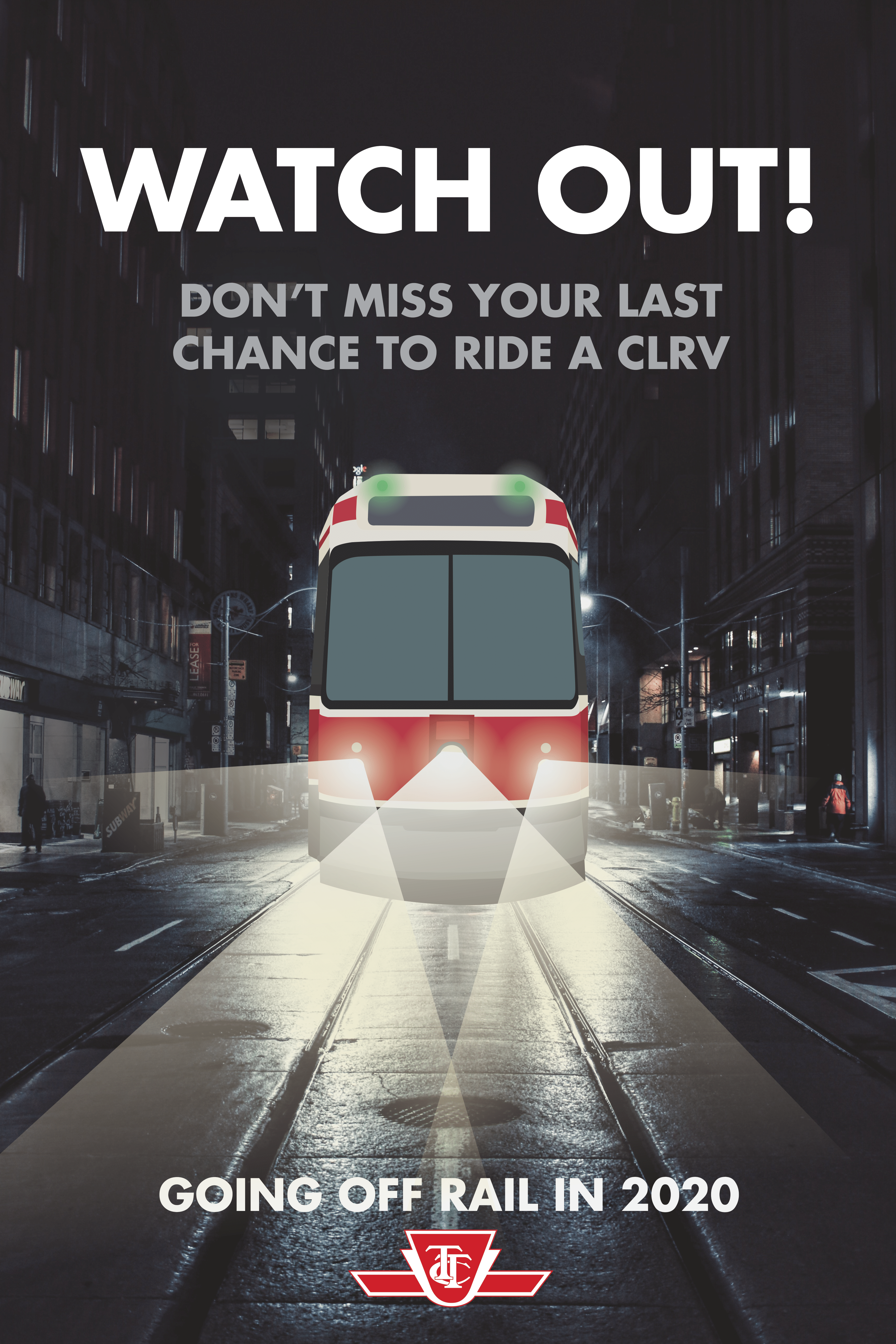
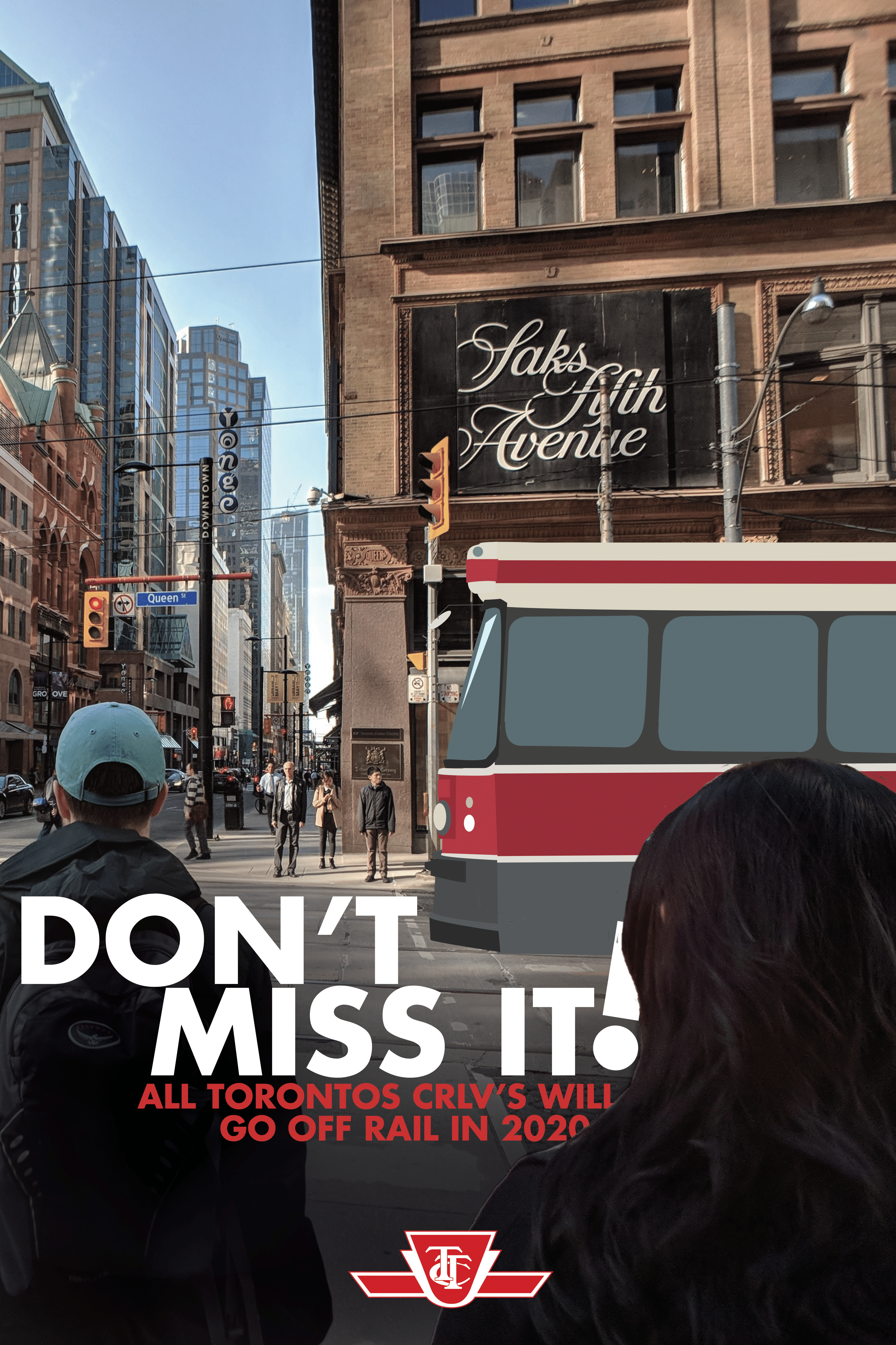
Watch out! Feels like you're about to be run over but I'm just jolting your awareness of the limited lifespan of these cute streetcars. Streetcar, lights and text designed in Illustrator. Background image sourced online in the public domain Another poster to raise awareness on the limited lifespan of the super cute trams. I like the depth made here with the text between the characters in the foreground. Made in Illustrator

I Like Trains a Normal Amount

2018

The final project in the Digital Design Studio course, which introduced me to animation, was to make two poster and an animation for an event. At the time the Toronto transit system was decommissioning their older streetcars, which I adored so much as they made me feel like I was on the Polar Express but understand their small capacity and steep steps were not friendly for the public.

The 'My Profile' page where one could update their status and view their Ikea wishlist or saved recipes. This is the home page which would show after a user has logged in, advertising the Daily Challenge first followed by options to join a call and then the featured recipes and articles This is what it would look like before a scheduled event begins, showing the ingredients so that users can prepare while they wait for the couple to start instructing.

Ikea Extension App Prototype

2020

For a course within my Advertising minor, our group was tasked with creating a prototype of an app which would help a brand connect with its customers during the pandemic. My group executed a concept for Ikea, which would share recipes and zoom style cooking lessons with friends or strangers. Participation builds points which can be redeemed for discounts on products marketed throughout the app.

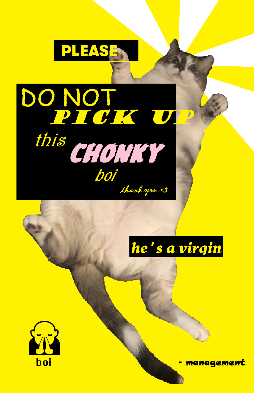
Created as a project for my Photoshop course, a visual of my cat supersized to play with a clock tower, topped with me sitting on the cat. All images were shot by me and compiled in Photoshop This two-colour design was designed for offset lithographic printing. I made this poster in Illustrator and used tints to enhance the visual effects with our limited ink options This poster was made for a friend's apartment as a defensive mechanism against visitors for the cat. This was a quick job made with Microsoft Paint for raw authenticity, I love the boldness
Drawn in Illustrator and inspired by a high school painting of miniature swimmers in a donut window which I wasn't quite satisfied with to share here, this much better wave of oil with the delicious tater tots served in my dorm cafe and tiny swimmers were designed for wide format digital printing labels, adhered to a transparent clipboard for submission This poster was made from a volunteer position in my fourth year for a theatre company. The most work was put into drawing the 'Ugly Stick' character which includes an item from the costume or story of every character. Compiled in Illustrator and Photoshop This is an isolated image of the Ugly Stick drawing I made for the Mummers Play poster. Entirely hand-drawn in illustrator, focused on including an aspect from each character's costume and story without masking the cultural function of the Ugly Stick as a noise-making device made out of 'whatever is available' This is one of many posters and social media posts I made in a voluntary role for my friends who were in the student groups running these events. This was part of the Mental Health Week series, the posters for other events that week maintained the visual theme but with new colours and graphics to differentiate

Posting & Posters

2018-20

Here is an assortment of graphic work made for class assignments or volunteering in my peers's endeavours during my university years

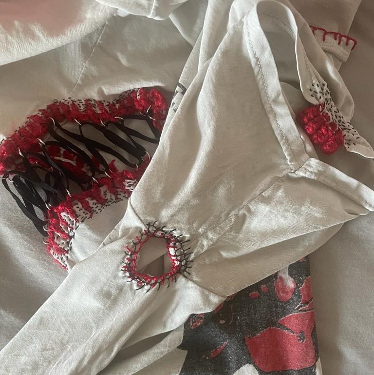
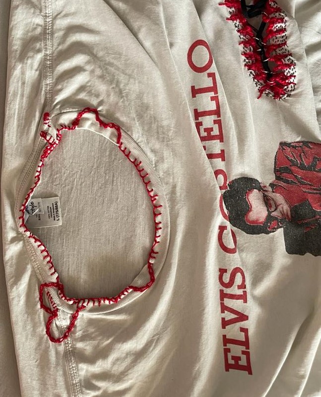
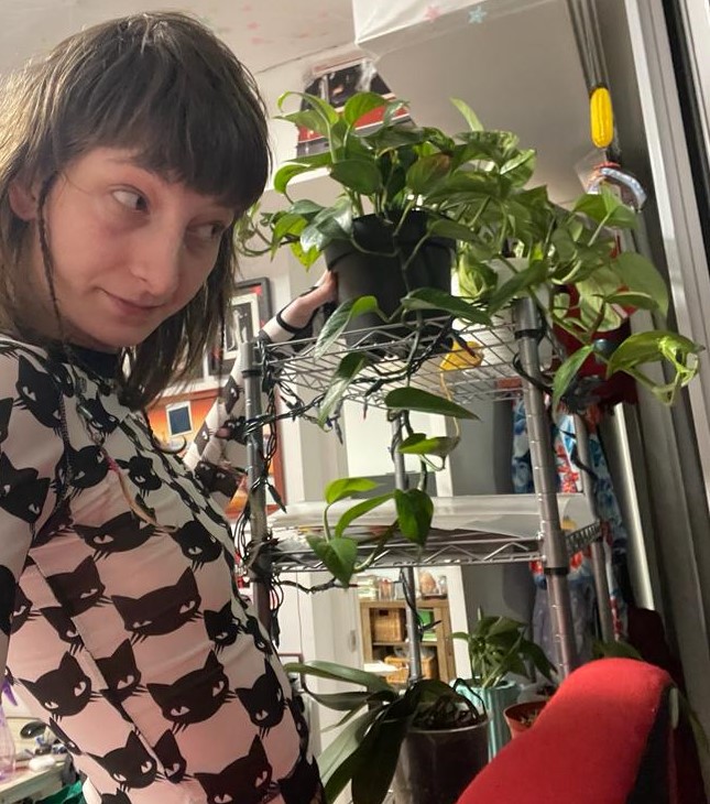
What an opportunity there is in knowing someone who could bore such grand holes in a shirt so that one day I could use it to practice new techniques. <br><br> On the left you can see the elastic corset, using yarn and embroidery thread to secure the metal loops and a black seed stitch to make sure it couldn't tear through the shirt. Similar methods were used in the hole below and on the sleeve you can see four tags also seen in traditional Nordic clothes, also secured to the shirt further with a black seed stitch pattern In the top right, you can see a more sealed style of the elastic corset, but the main feature here is the neckline mending done with red embroidery thread. I didn't just want to loop around the edges so I changed to a honeycomb stitch to make some loops into the shirt, eventually making the heart and patching up any nearby tears. This is a selfie of me and my one-year-old Pothos plant I am most proud of currently and was the start of my indoor plant journey I got big feet with strong nails and cute socks I don't want to throw away. I picked up darning these holes starting with a wooden mushroom which is inside of the sock in this photo, but now I have a mini-loom to make things faster
Work in progress of my first carpet, the sketches were drawn onto the canvas with the aid of a projector. The rainbow in the corner was me testing the machine before I started my first project with it After the carpet is tufted, glued and dried, it is time to use animal trimmers to shave the yarn edges for a clearer effect. Shortening the fibres where the colours meet one another prevents them from mixing and blurring the desired illusion, which was to be a vortex tunnelling down from my hallway floor After the vortex, I started tufting portraits of my late cat, admittedly her passing did make progress on this work difficult

Hobbies at Home

2023

After getting holes in some socks I just didn't want to part with, I got into visible mending. After picking up some library books, I tested every new technique on a partner's shirt full of holes. I pride myself on my plants too. The biggest hobby currently is carpet tufting, I find it so hardcore to work on.

Made by hand carving a lino block, making my prints and then carving out some more to print the next colour. This collage is reminiscent of the rise of skate culture beginning in the 1960s Linoblock is a rad medium I was excited to work with again, but I wanted a new challenge, something with quirk for my quirky vision of Spiderman riding a Vespa and slinging spaghetti.
                 So I tried it with cake fondant, which isn't easily paintable or structurally sound. Spidey's limbs sacrifice rigid joints for a more fluid bend and the fondant spaghetti was replaced with a piece of actual dried spaghetti. Placed on a cake and submitted on my teachers actual birthday, easily the most fun project that year There is my pretty kitty, how cute is she?! <br> <br> This photo was taken near the end of my process in making a re-imagination of Lichtenstein's 'Whaam!' to capture the iconicity and curiosity of the JFK assassination. The world was introduced to both events in 1963

Teen Favourites

2017

Those teachers really supported our wildest ideas, supportive instructions for any endeavour. In senior year we just had to submit six pieces of work, could be anything as long as they share a theme. I went for the 1960s, a decade full of iconic moments that my possibilities felt endless.